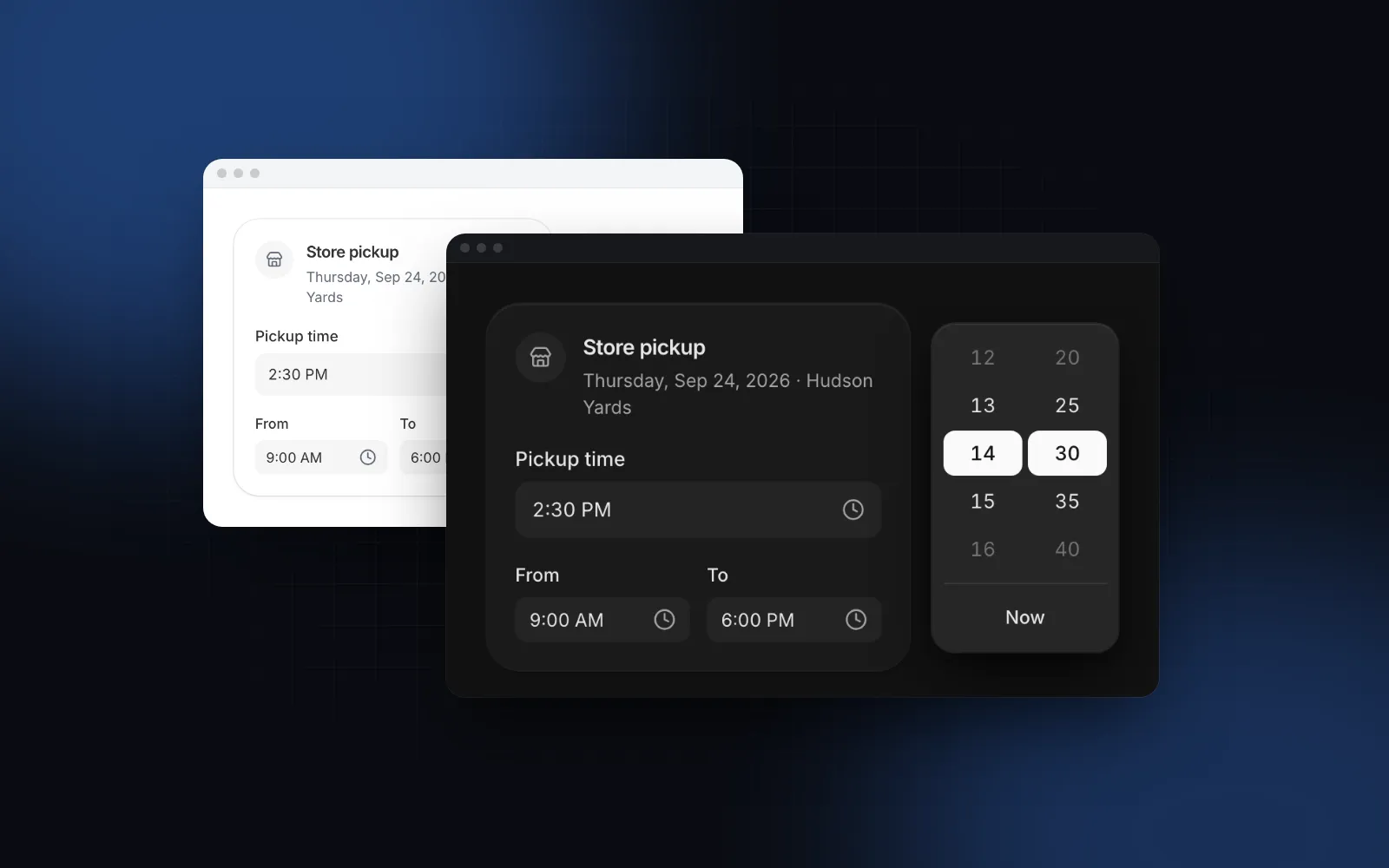
Shadcn Date Time Picker with Time Zones and Presets
You want a shadcn date time picker for a booking, a reminder or a scheduled send: one field where someone picks a day and a time, sees which time zone it is in, and gets a value your server can store without guessing. shadcn/ui gives you a Calendar and an input, and you wire up the rest. This guide covers what that wiring has to solve, the props that matter in the Wingo UI Date Time Picker, how to pair it with a Timezone Select, and what both turn into on a phone.
Does shadcn/ui have a date time picker?
No. As of November 2026 the shadcn/ui Date Picker docs (opens in a new tab) include a "Time Picker" example, and its source (opens in a new tab) shows the pattern: shadcn's Calendar inside a Popover for the day, and next to it a plain <Input type="time" step="1" defaultValue="10:30:00" />. The day lives in React state as a Date, the time stays inside the uncontrolled input, and nothing joins the two. That is a fine starting point, and it leaves four jobs to you:
- One value. You have a
Dateat local midnight and a"10:30:00"string. Somebody has to merge them, in the right time zone. - Time zones. The browser's zone is assumed everywhere. The Calendar underneath is react-day-picker, whose timeZone prop (opens in a new tab) renders the days in an IANA zone but does not pick a time of day.
- Availability. A native time input accepts any minute. It cannot strike through 10:00 because it is already booked.
- Phones. The popover is anchored to a small trigger, and the native time control looks different in every browser.
Community shadcn datetime picker repos fill part of the gap. As of November 5, 2026, rudrodip/shadcn-date-time-picker (opens in a new tab) has 310 GitHub stars, an MIT license and a last push in May 2025. It ships 12 and 24 hour variants that put hour and minute button columns next to the calendar in one popover, plus react-hook-form and zod examples; its README does not mention time zones or a phone layout. maliksidk19/shadcn-datetime-picker (opens in a new tab) has 281 stars and a last push in July 2026, and its README lists a lot: a calendar beside a scrollable time list in one popover, a timezone selector with offsets, 15, 30 or 60 minute intervals with min and max times, and a Drawer below 768px. It is free (MIT according to its README) and enough for many forms. Where it stops is per-day availability: the README covers fixed intervals, time limits and disabled dates, but nothing that marks a single slot as taken.
What should a React date time picker do?
A React date time picker is done when the person can answer "when?" in one place. In practice that means:
- A calendar and the free times for the chosen day, side by side, the way booking pages work.
- One absolute value: a
Datethat means the same instant everywhere, never a local date plus a loose time. - A visible time zone. "2:30 PM" means nothing in a team spread across New York and Berlin. The label belongs in the panel, with the UTC offset for that date, because daylight saving time changes it.
- Shortcuts. Most reminders are "in an hour" or "tomorrow morning".
- A layout for thumbs. Below 768px a popover with two columns does not fit. A bottom sheet with large chips does.
Which props matter in the Wingo UI Date Time Picker?
Most forms need only the value, timeZone, the slot grid or getTimeSlots, the limits, presets and name. Install it with npx wingo-ui@latest add date-time-picker. The CLI copies components/ui/date-time-picker.tsx into your project and pulls in the Calendar, Select, Drawer, Field and the date and motion helpers it imports.
The value is a Date | null, controlled with value and onValueChange or uncontrolled with defaultValue. The props you will reach for:
timeZone: the IANA zone the wall times are picked in ("America/New_York"). The calendar and slots show that zone's clock, and wall times skipped by a daylight saving jump are disabled. Leave it empty for the device zone.minuteStep,startTime,endTime: the default slot grid, 15 minutes from"00:00"to"23:59". UsestartTime="09:00"andendTime="17:00"for business hours.getTimeSlots: per-day availability that replaces the grid. Return"HH:mm"strings or{ time, disabled, label }objects, or a Promise of them. Answers are cached per function and day, so define it outside the component.disablePast,min,max,disabledDays: limits.disabledDays={{ dayOfWeek: [0, 6] }}closes weekends.presets:truefor In 1 hour (rounded up to the step), Tomorrow 9:00 and Monday 9:00, or your own{ label, value }list.showTimeZoneandtimeZones: the zone label in the footer is on by default; atimeZonesarray turns it into a select.name: submitsvalue.toISOString()through a hidden input, so a plain form or a Server Action gets a UTC string.
Open the field below, try a preset, then pick a day and a time. Taken slots are struck through, and the footer names the zone.
$ npx wingo-ui@latest add date-time-pickerKeyboard: arrows move by day and week, Tab moves to the time list, typing 14 jumps to 2:00 PM, Enter picks and closes, Escape returns focus to the field.
How do I add a time zone picker next to it?
Put a React timezone select above the picker and pass its value to timeZone. You need one when the zone is a choice the person makes, such as a host scheduling a call for a client abroad. The Wingo UI Timezone Select lists every zone the browser knows, grouped by region, with live UTC offsets. People can search by city ("tokyo"), abbreviation ("CET") or offset ("+5:30"), and a first row picks their own zone. Install it with npx wingo-ui@latest add timezone-select.
$ npx wingo-ui@latest add timezone-selectThe Date Time Picker follows its timeZone prop, so a new zone redraws the calendar and the slots in that zone's clock. The Timezone Select also takes a name, so the zone id goes out with the form.
How do I build a booking field with a time zone?
Here is a complete React date time picker with timezone support: a client form with the zone select above the picker, availability from a stable function, and a Server Action that receives the ISO string and the zone id.
getTimeSlots receives a local midnight Date for the wall day in the chosen zone, so day.getDay() is the weekday the person sees. Keep the function at module scope or wrap it in useMemo, because the picker caches its answers per function and day. The client never has the last word on availability: two guests can open the same free slot, so the action checks it again before saving.
Should the time stay the same when the zone changes?
The picker keeps the moment: a 2:30 PM call in New York reads 11:30 AM after switching to Los Angeles. That is right for "when does this meeting happen for me". For "9 AM wherever I am", keep the wall time and move the moment with the helpers the file exports:
Call it in the select's onValueChange before you update the zone. zonedTimeToDate handles daylight saving: a repeated hour gives its first occurrence, and formatTimeZoneLabel(zone, date, "en-US") prints the zone with the offset for that date ("Eastern Time (UTC−04:00)" in July, "Eastern Time (UTC−05:00)" in December).
What does it look like on a phone?
With responsive on (the default), below 768px the field opens a bottom sheet instead of a popover. The calendar takes the full width, presets and times become horizontal rails of 44px chips, and the chosen time scrolls to the center. The pick is a draft until the big Done button commits it, so dragging the sheet away keeps the old value. The Timezone Select does the same on its side: a tap opens a full-height search sheet with 48px rows and a Cancel button. We picked a sheet because a popover anchored to a field near the bottom of the screen opens under the keyboard or the thumb that tapped it. The responsive dialog guide explains the same trade-off for dialogs.
The inline prop renders the panel in the page without a trigger, which suits a booking page. Below 640px it puts the times in a grid under the calendar.
$ npx wingo-ui@latest add date-time-pickerThe demo booking page template shows a whole book-a-demo screen built around a Calendar and a time step, if you want the page as well as the field.
When should I use a different picker?
- Only a time of day, like opening hours or a daily reminder: the Time Picker stores
"HH:mm"and accepts typed input such as "2p". The React time picker guide covers it. - A start and an end date: the React date range picker guide.
- Only a day, with typing: the Date Picker.
- A calendar of existing events with drag to reschedule: the React calendar with events guide.
What are the common pitfalls?
- Building the Date on the server.
new Date("2026-11-12 14:30")uses the server's zone. Convert in the person's zone instead. - Storing local time without the zone. Save the UTC instant and the IANA id. An offset like
-05:00is not enough, because it changes in March. - A new
getTimeSlotson every render resets the cache and refetches. - Hydration. "Now" differs between the server and the browser. The picker reads the clock after hydration, so presets and
disablePastsettle on the client; passnowin tests and screenshots.
How do I get it?
Run npx wingo-ui@latest add date-time-picker timezone-select and the CLI copies both into components/ui with everything they import. They are Pro components: $8 a month, $80 a year or $150 once (pricing). Open the Date Time Picker docs to try every prop in the playground first. More single-component deep dives live in the component guides category, and the React form components guide shows how the fields fit together.
FAQ
Does shadcn/ui have a date time picker?
Not as of November 2026. The Date Picker docs include a Time Picker example that puts a Calendar popover next to a separate input type="time", with the date and the time kept in two different pieces of state.
How do I combine a date and a time into one Date in React?
Build the moment in the time zone the person meant, not in the server's: take the day as "YYYY-MM-DD" and the time as "HH:mm" and convert them together. The Wingo UI helper zonedTimeToDate("2026-11-12", "14:30", "America/New_York") returns the absolute Date and handles daylight saving changes.
What should a React date time picker with timezone submit to the server?
An ISO string in UTC for the moment and the IANA zone id next to it, such as 2026-11-12T19:30:00.000Z and America/New_York. The ISO string is unambiguous, and the zone lets you show the time later the way the person picked it.
What happens to the picked time when the time zone changes?
In the Wingo UI Date Time Picker the moment stays and the wall clock moves, so a 2:30 PM New York call reads 11:30 AM in Los Angeles. If you want to keep 2:30 PM and move the moment instead, convert it with getZonedParts and zonedTimeToDate.
Is the Wingo UI Date Time Picker free?
No. The Date Time Picker, Timezone Select, Calendar and Time Picker are Pro components; Pro costs $8 a month, $80 a year or $150 once. The Button, Field, Select and Drawer they build on are free.
- Date picker
- Time zones
- Forms
- Mobile UI
- shadcn