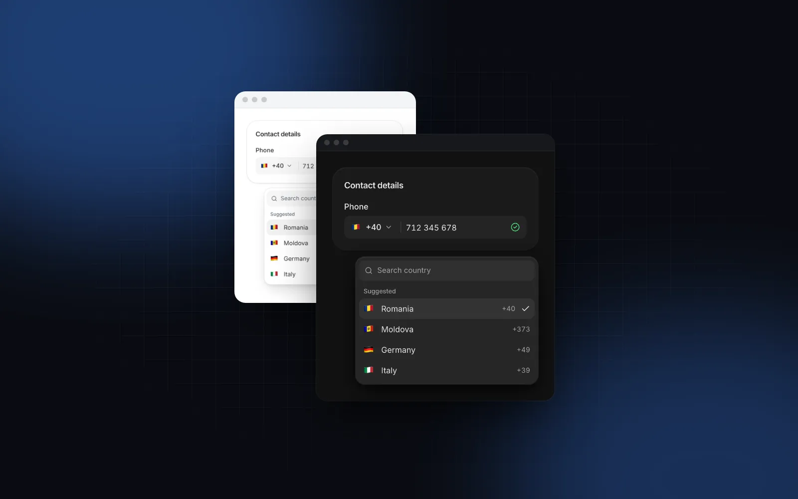
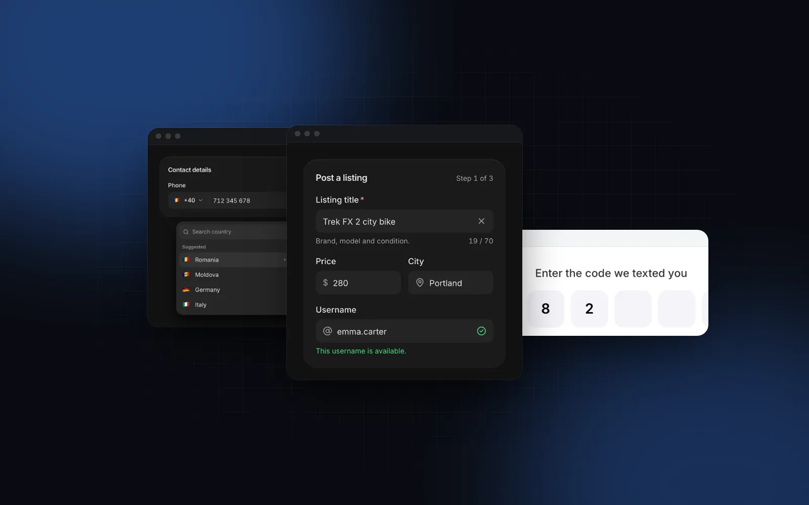
React Country Select With Flags, Search and Dial Codes
A React country select looks like the easiest field on a checkout form. Then real users arrive: someone in Munich types "deutschland", someone in London types "UK", a Windows laptop shows "US" where the flag should be, and your database holds "United States", "USA" and "United States of America" for the same customer. This guide covers what the field needs to do, which npm packages exist, and how to use the Wingo UI Country Select for a searchable country dropdown with flags, localized names, dial codes and multiple selection. It also covers when a Phone Input or a Timezone Select is the field you actually want.
What should a React country select do?
Seven things separate a country picker that takes a second from one people scroll through:
- Store the ISO code. The value is
"US"or"DE". The name is presentation. - Names in the reader's language. A German visitor sees Deutschland, Frankreich and Vereinigte Staaten, sorted the German way.
- Search that forgives. Match the localized name, the English name, the ISO code, the dial code (
+44) and the short names people type (USA,UK,Holland), with accents ignored, socotefinds Côte d'Ivoire. - The likely country first. A "Suggested" group with the visitor's own country or your top markets, so most people never search.
- Flags that render everywhere. Emoji flags are free, except on Windows, which shows letters.
- A real form value. A hidden native
selectwithautocomplete="country"soFormDatagets the code and browser autofill fills it from a saved address. - A phone layout. About 245 rows in a popover anchored to a 44px field are hard to scroll with a thumb. A bottom sheet with the search pinned on top works better.
Which React country select packages are there?
If you search npm for a react country dropdown with flags, four packages come up, each covering a different part of the job. As of November 6, 2026, from the npm registry and each README:
All four npm packages are MIT licensed. The Wingo UI component is part of the paid Pro plan. If you only need flags in a plain dropdown and want a free package, react-flags-select is the most direct fit. If you need regions or states under the country, react-country-region-selector does that and the Wingo UI component does not.
A shadcn country select is not in the official shadcn/ui registry (opens in a new tab), which lists 65 UI components as of November 6, 2026 (it has select, native-select and combobox). Community versions exist; check what each one uses for names and flags before you copy it.
How do you build a React country select with flag icons?
Install it with npx wingo-ui@latest add country-select, then render it with a label, a value and a few priority countries:
label, description and error render the shared Field anatomy around the trigger, with the label tied to it and the hint linked through aria-describedby. Without priority, the suggested group holds the country of the locale, so en-US suggests the United States and en-GB the United Kingdom. Pass priority={[]} to drop the group.
$ npx wingo-ui@latest add country-selectTo limit the list to the countries you ship to, pass countries={["US", "CA", "MX", "DE", "FR"]}. To remove a few, pass exclude. With eight countries or fewer the search row hides itself (search="auto"); set search="always" or "never" to override that.
How do country names get localized?
Older country packages ship a JSON file of English names, plus one more file per language you register. Browsers already know every country name in every major language through Intl.DisplayNames:
The Country Select does this for you. Its locale prop sets the language of the names and the sort order. Without it, the component reads the locale from UIProvider, then from the browser. A German list sorts with a German collator, and the English names stay searchable, so a visitor who types "germany" in a German list still finds Deutschland.
The same helpers are exported for your own UI, such as an order summary:
One detail that bites in Next.js: Node and Chrome can ship different ICU data, so a few names differ between server and browser (Hong Kong and Macao are examples), and a server-rendered list of about 245 sorted names can fail hydration. The Country Select renders only the chosen country on the server and builds the full list after hydration, so the markup matches.
Should you store the country name or the ISO code?
Store the code. Names depend on the language and change over time (Turkey is Türkiye in English now), while "TR" stays "TR". Stripe's address country field and most carrier APIs take the ISO 3166-1 alpha-2 code.
With name, the component renders a hidden native select (one hidden input per country with multiple) that submits the code. Its autoComplete defaults to "country", so when the browser fills a saved address, the picker updates too. Validate the code again on the server. libphonenumber-js is already a dependency of the component and exports isSupportedCountry:
Then <form action={saveAddress}> around the CountrySelect name="country" is all the wiring a plain form needs.
How do you show dial codes and pick several countries?
For a react country code dropdown, add showDialCode. The calling code (+1, +44) appears at the end of each row and after the chosen name. Dial codes are searchable with or without it.
For "Ships to" or "Markets" fields, add multiple. The value becomes a string[], each pick adds a chip with its flag, and the list stays open while you pick:
maxSelected caps the count, display switches between chips, count ("3 selected") and text, maxVisibleChips folds the rest into "+N", and wrap lets chips grow the field onto more lines. The multi mode is built on the Multi-select, and the React multi select guide covers chips, select all and limits in depth.
$ npx wingo-ui@latest add country-selectWhy do flags show as letters on Windows?
An emoji flag is two regional indicator characters: US becomes 🇺🇸. macOS, iOS, Android and most Linux desktops draw them as flags. Windows ships an emoji font without national flags, so Chrome and Edge there draw the two letters (Firefox bundles its own emoji font with flags). On any Windows browser the Country Select swaps the emoji for a small code chip after mount, which reads better than two loose letters and looks the same in every browser. Force one or the other with CountryFlag's fallback prop.
If your design needs real flags on every platform, pass your own SVG set through renderFlag:
How does it behave on phones and with a keyboard?
Below 768px the field opens a bottom sheet instead of a popover (responsive, default true). The title comes from the label, the search sits pinned under it, rows are 48px tall, and the list renders only the rows in view once it passes virtualThreshold (100), so scrolling about 245 countries stays smooth. On touch, search="auto" waits for a tap on the search row before it focuses, so the keyboard does not cover half the list the moment the sheet opens. With multiple, a Done button closes the sheet.
On a keyboard, typing a letter on the closed field opens the list with that letter in the search. Enter, Space or ArrowDown open it on the chosen country. Inside, the arrows move, PageUp and PageDown jump, Enter picks, and Escape closes and returns focus to the field.
When is a phone input or a timezone select the better field?
A country select is the right field when the country is the data: a shipping or billing address, a tax residence, the markets a store sells to. Two neighbors often do the job better:
- You want a phone number. Do not put a country select with dial codes next to a text input. The Phone Input has the country button built in, formats the digits for that country as you type, switches the country when someone pastes
+44 7400 123456, and returns one E.164 string. The React phone input guide covers validation. - You want a time zone. A country does not tell you the time zone (the United States has several). The Timezone Select searches by city, abbreviation or offset, shows UTC offsets and offers "Use my time zone".
$ npx wingo-ui@latest add phone-inputOn a checkout or sign-up form you often use two of them together: a Country Select in the address and a Phone Input under it, both on the same Field anatomy, so labels, errors and sizes line up. The React form components guide covers that anatomy and the rest of the fields, and the component guides category has the other deep dives.
Which pitfalls show up in production?
- Saving the display name. You end up mapping "Deutschland" back to
DEin a migration. Save the code from day one. - Hardcoding
en-US. Visitors from other countries search in their own language. Leavelocaleempty to follow the browser or set it once onUIProvider. - A suggested group nobody asked for. If the locale guess is wrong for your audience (an English browser in Germany suggests the US), pass your real top markets to
priority. - A hand-rolled hidden input. Without a native
selectthat carriesautocomplete, autofill fills the street and skips the country. Passnameand let the component render it. - A full list for three options. If you deliver to three countries,
countrieswith three codes (or a radio group) beats a searchable list of 245.
How do you install it?
Run npx wingo-ui@latest add country-select. It copies the component with the Select, Multi-select and Field parts it uses and installs libphonenumber-js plus the packages those parts need. The Country Select is part of Wingo UI Pro ($8 a month, $80 a year or $150 once), so sign in first with npx wingo-ui@latest login. The Field and the single Select are free with a free account, if you want to start with a short, fixed list of countries and upgrade later.
FAQ
How do I make a React country select with flags?
Build the list from ISO 3166-1 alpha-2 codes, turn each code into its emoji flag from two regional indicator letters (or render an SVG flag), and get the name from Intl.DisplayNames in the reader's locale. Add a search row, put the likely country first and store the code as the value.
Why do country flag emojis show as two letters on Windows?
Windows ships an emoji font without national flags, so Chrome and Edge on Windows draw the two regional indicator letters instead of the flag (Firefox bundles its own emoji font with flags). Detect Windows and show a small code chip, render SVG flags, or load a flag emoji polyfill font.
Should I store the country name or the country code?
Store the ISO 3166-1 alpha-2 code, such as US or DE. Names change between languages and over time (Turkey became Türkiye), while the code stays stable and is what payment and shipping APIs such as Stripe expect.
Does shadcn/ui have a country select?
No. As of November 6, 2026 the official shadcn/ui registry lists 65 UI components and none of them is a country select, so shadcn projects use a community component or build one on Select or Combobox.
How do I localize country names in React without a translation file?
Use Intl.DisplayNames with type region: new Intl.DisplayNames(["de-DE"], { type: "region" }).of("DE") returns Deutschland. It is built into current browsers and Node, so you do not ship a JSON file of names per language.
Is the Wingo UI Country Select free?
The Country Select, the Phone Input and the Timezone Select are part of Wingo UI Pro. The Field and the Select they build on are free.
- Forms
- Country select
- Internationalization
- React