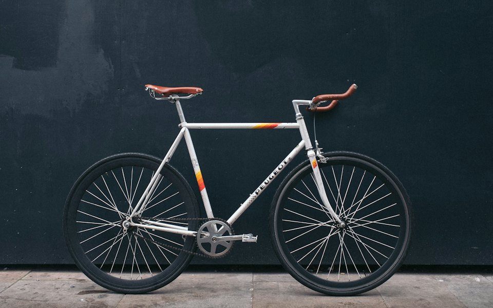
City bike, 26-inch wheels
$320, Negotiable
26" wheels · 3 gears · Frame M
Brooklyn, Park Slope
DeliveryUsed
Commerce
Seller card
v1.0.0Added in 1.0.0
A React seller card for marketplaces: avatar, verified mark, stars, reply speed, a phone number to reveal, message, follow, more listings.
Tap the call button to show the seller's number: it fetches the full number (a spinner holds the button's width), the digits fade in, and the button turns into a real phone link, so the next tap dials. With a mouse a copy button appears beside the revealed number. If the number cannot be fetched, the button goes back to masked and a short message says so. Tap Message to start a conversation. Tap Follow to follow the seller: a check draws itself, and it rolls back if saving fails. The name opens the seller's profile; hover or focus it to see what was verified (on touch the same list sits in the stats). The compact row is one big tap target that opens the profile. The other listings are compact rows, or a rail you swipe (drag with a mouse, Left / Right while it has focus). Keyboard: Tab reaches the name, Follow, the call and message buttons, the listings and See all; Enter or Space activates, and focus stays on the call button when it becomes a link. The revealed number and errors are announced. In a narrow two-column bar the call button drops its icon so the digits fit.
Seller card is a Pro React component in the React commerce components category, written in TypeScript for React 19 and Tailwind CSS v4. It installs as source with npx wingo-ui@latest add seller-card, together with Avatar, Badge, Button, Carousel, Copy Button and 12 more and the npm packages lucide-react and motion.
Requirements: React 19 and Tailwind CSS v4, in Next.js (App Router or Pages), Vite or React Router. Installation guide · Next.js setup · Vite setup
npx wingo-ui@latest add seller-cardSeller card is part of Pro, with 298 more Pro items: $8 a month or $150 once. 14-day refund before you download any Pro item. See plans
Import SellerCard from @/components/ui/seller-card.
import { SellerCard, type SellerData } from "@/components/ui/seller-card"

const mihai: SellerData = {
  id: "s-mihai",
  name: "Michael Reed",
  avatar: "/demo/mihai-ionescu.jpg",
  href: "/sellers/mihai-ionescu",
  type: "private",
  verified: { phone: true, identity: true },
  rating: 4.8,
  reviewCount: 126,
  memberSince: "2019-03-12",
  responseRate: 0.98,
  responseTime: 40,
  location: "Brooklyn",
  listingCount: 14,
  phone: "07700 900 •••",
}

export function ListingSidebar({ openChat }: { openChat: () => void }) {
  return (
    <SellerCard
      seller={mihai}
      callingCode="44"
      onRevealPhone={async () => {
        const response = await fetch("/api/listings/l01/phone", { method: "POST" })
        return (await response.json()).phone as string
      }}
      onMessage={openChat}
      listingsHref="/sellers/mihai-ionescu"
      labels={{ showNumber: "Reveal number", message: "Chat" }}
    />
  )
}seller*SellerDataThe seller: { id, name, avatar?, href?, type?: "private" | "business", companyName?, cui?, agent?, verified?: boolean | { phone?, identity?, company? }, rating? (0 to 5), reviewCount?, memberSince?, responseRate? (0 to 1), responseTime? (minutes), lastSeen?: time | "online", location?, listingCount?, phone? }.
variantdefault "card""card" | "compact" | "inline"card: the side column of a detail page with stats, contact and listings. compact: avatar, name, rating, one stat and a chevron as one tappable row (the phone detail page). inline: a small avatar, the name, the verified mark and a star on one line, no surface.
sizedefault "md""sm" | "md" | "lg"Avatar 40 / 48 / 64px in the card, the type scale, paddings and the contact buttons (md in sm, 48px lg otherwise).
radiusdefault "md""sm" | "md" | "lg"The surface corner: 12 / 16 / 24px. The buttons and listing tiles inside follow it.
tonedefault "neutral""neutral" | "brand" | "success" | "warning" | "danger" | "info"The call button (solid) and the message button (soft of the same tone).
colordefault ""stringAny CSS color for the contact buttons; replaces the tone.
ratingTonedefault "neutral""neutral" | "brand" | "success" | "warning" | "danger" | "info"The stars' fill. warning gives the classic amber stars.
showStatsdefault truebooleanThe card's facts: private or business (with the tax id), what was verified, member since, reply time, response rate, place, last activity, listing count.
showRatingdefault truebooleanStars, the value and the review count; a seller without reviews gets a "New seller" badge instead.
showContactdefault truebooleanThe call and message buttons (SellerContactActions) in the card.
showFollowdefault falsebooleanA Follow toggle in the card's header: icon only in a narrow card, with its label from 400px.
defaultFollowingdefault falsebooleanStarts followed (uncontrolled). Use following + onFollowingChange to control it.
followingbooleanThe controlled follow state.
onFollowingChange(following: boolean) => (void | Promise<unknown>)Called on every toggle. Return a promise: a rejection rolls the toggle back and announces labels.followError.
onRevealPhone() => (string | Promise<string>)Show number fetches the full number (marketplaces log reveals). A spinner shows while it runs; a rejection returns the button to masked and says labels.revealError. Without it seller.phone is revealed on tap. The revealed number is kept per seller.id for the page's life, so a sticky contact bar shows it too.
onCall(phone: string) => voidReplaces the tel: link of the revealed number (open a call sheet, log the call).
onMessage() => voidThe Message button. Without it and without messageHref there is no Message button.
messageHrefdefault ""stringMakes Message a link to the conversation.
callingCodedefault ""stringThe country calling code for the tel: link: "44" turns 07700 900 123 into tel:+447700900123. Empty keeps the number as written.
contactLayoutdefault "auto""row" | "stack" | "auto"Call and Message side by side, stacked, or auto: stacked while the card is under 400px wide (a sidebar, a phone), side by side above.
listingsListingData[]The seller's other listings (ListingData from listing-card), shown under the contact buttons.
showListingsdefault truebooleanThe listings section, when there are listings.
listingsHrefdefault ""stringThe "See all (14)" link beside the heading; the count is seller.listingCount.
listingLayoutdefault "compact""compact" | "grid"Compact listing rows, or a swipeable rail of small grid cards with one photo each (no carousel inside a carousel).
maxListingsdefault 3numberHow many listings to show.
listingsLoadingdefault falsebooleanSkeleton rows in place of the listings while they load.
compactStatdefault "auto""auto" | "lastSeen" | "memberSince" | "responseTime" | "location" | "listings"The one fact beside the rating in the compact row. auto: the last activity, else the reply time, the place, then member since.
onSelect(seller: SellerData) => voidWithout seller.href, the compact row and the name become buttons that call it.
nownumber | nullThe page's clock in ms for "Active 5 minutes ago". Defaults to a shared minute timer (useNow); null prints dates. A timestamp, so it stays out of the playground.
linkComponent(props: LinkComponentProps) => ReactNodeThe router link for the name, the compact row, Message, See all and the listings. Defaults to the LinkProvider's, then <a>.
localedefault ""stringNumbers, dates and relative times. Empty uses the UIProvider locale, then the browser's.
labelsPartial<SellerCardLabels>Every string, English by default (DEFAULT_SELLER_CARD_LABELS): verified, verifiedIdentity, verifiedPhone, verifiedCompany, business, private, newSeller, memberSince(date), responseRate(percent), responseTime(text), withinHour, withinDay, online, lastSeen(text), listings(n, formatted), reviews(n, formatted), rating(value), agent(name), cui, call, callSeller(name), showNumber, revealNumber(name), message, messageSeller(name), copyNumber, copiedNumber, revealed(phone), revealError, follow, following, followError, otherListings, seeAll(n, formatted), loadingListings, the hidden stat names (statType, statVerification, statMemberSince, statResponseTime, statResponseRate, statLocation, statActivity, statListings, statAgent) and listing (forwarded ListingCardLabels).
classNamesPartial<Record<"header" | "avatar" | "name" | "verified" | "type" | "rating" | "stats" | "stat" | "contact" | "call" | "message" | "follow" | "listings", string>>Extra classes for the inner parts.
classNamestringExtra classes for the root, merged last.
The call / message pair on its own, with the same reveal (shared per seller.id with every card on the page). It is what a listing page's sticky contact bar holds as its action. Props: { seller?, phone?, onRevealPhone?, onCall?, onMessage?, messageHref?, callingCode?, layout?: "row" | "stack" | "auto" = "row", size?: "sm" | "md" | "lg" = "lg", radius?, tone?, color?, showCopy? = true, linkComponent?, labels?, classNames? }.
Keeps the first `visible` digits (7) and the formatting: "0745 123 456" becomes "0745 123 •••". A masked number passes through. Signature: (phone: string, visible?: number) => string.
The English strings; spread them to translate a few. Type: SellerCardLabels.
Green House Realty: a Business badge, the tax ID, the agent, amber stars and a rail of listings.
One tappable row under the listing that opens the seller's profile.
The small avatar, name, verified mark and stars as a card footer.
No reviews yet: a New seller badge instead of stars, joined in August 2026.
The fetch fails, the button returns to masked and the error is shown and announced.
SellerContactActions on its own, next to a favorite button, as a sticky contact bar holds it.
An optimistic follow toggle whose check draws itself, and tone brand on the call button.
The preview, props and docs are free; copying the source needs a Pro plan. See plans.
Run npx wingo-ui@latest add seller-card. It also adds the Wingo UI items it builds on (Avatar, Badge, Button, Carousel, Copy Button and 12 more) and the npm packages lucide-react and motion. With shadcn, add the @wingo-ui registry with your API key, then run npx shadcn@latest add @wingo-ui/seller-card.
router: /listings/l01 · reveals: 0 · dials: tel:07700900123 · follow: none yet · chat: closed
Tap the call button to show the number, then tap again to dial