Favorite button React component for Tailwind CSS v4
v1.0.0Added in 1.0.0
A React favorite button: a heart that fills with a spring pop and a burst, keeps a count, saves optimistically and rolls back on failure.
Tap or click the heart to save: it dips, pops past its size on a bouncy spring, fills in and throws a ring and a handful of particles; tap again and the fill shrinks away. With a count the number rolls up or down by one right away. While the save request is pending further taps are ignored; when it fails the heart shakes, goes back to how it was and the error is read out. On a phone a light tick answers the tap, every size has a 44px target, and the glass heart on a photo sits above the card's link so it never opens the listing. With a mouse the action shows as a tooltip. Tab to it and press Space or Enter to toggle; screen readers hear one constant name, the pressed state and the count.
Favorite button is a Pro React component in the React commerce components category, written in TypeScript for React 19 and Tailwind CSS v4. It installs as source with npx wingo-ui@latest add favorite-button, together with Tooltip, useControllableState, useLocale, useMediaQuery, Haptics and 4 more and the npm packages lucide-react and motion.
Add to a project
Requirements: React 19 and Tailwind CSS v4, in Next.js (App Router or Pages), Vite or React Router. Installation guide · Next.js setup · Vite setup
npx wingo-ui@latest add favorite-buttonFavorite button is part of Pro, with 298 more Pro items: $8 a month or $150 once. 14-day refund before you download any Pro item. See plans
Usage
Import FavoriteButton from @/components/ui/favorite-button.
import { FavoriteButton } from "@/components/ui/favorite-button"

const labels = {
  name: "Save listing",
  add: "Add to your watchlist",
  remove: "Remove from your watchlist",
  error: "We could not save it. Try again.",
}

export function ListingPhoto({ saved, onSave }: { saved: boolean; onSave: (saved: boolean) => Promise<unknown> }) {
  return (
    <div className="relative aspect-[4/3] overflow-hidden rounded-2xl bg-foreground/5">
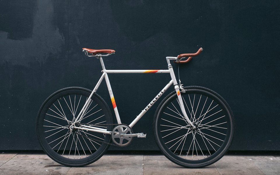
      <img src="/demo/bicycle.jpg" alt="Pegas Popular city bike" className="size-full object-cover" />
      <FavoriteButton
        variant="overlay"
        tone="danger"
        pressed={saved}
        onPressedChange={onSave}
        labels={labels}
        className="absolute end-2.5 top-2.5"
      />
    </div>
  )
}
Props
defaultPresseddefaultfalsebooleanStarts saved. The button then owns its state.
pressedbooleanControlled on / off. While a request is pending, a change of this prop wins and the pending answer is ignored.
onPressedChange((pressed: boolean) => void | Promise<unknown>)Called with the new state when a person toggles it. Return a promise to keep the optimistic state while it is pending (clicks are ignored meanwhile); a rejection, or a synchronous throw, rolls back, shakes, buzzes on touch and announces labels.error.
variantdefault"ghost""ghost" | "overlay" | "soft" | "outline"ghost: a bare icon button for rows and headers. overlay: a round glass button for photos (white heart, black glass in both themes). soft and outline: a chip for counts and labels.
sizedefault"md""sm" | "md" | "lg"Icon only: 32 / 40 / 48px (the overlay 32 / 36 / 44px) with a 16 / 20 / 22px heart; md grows to 44px on touch and the rest get a 44px hit area. Chips take the button heights.
radiusdefault"full""none" | "sm" | "md" | "lg" | "full"Corner shape, scaled per size like the button. full is a circle, or a pill for chips.
tonedefault"neutral""neutral" | "brand" | "success" | "warning" | "danger" | "info"The on color. neutral fills black / white (white on photos); the classic red heart is danger. The chip tints use the tone's soft colors.
colordefault""stringAny CSS color for the filled heart, the burst and the chip tint. Replaces the tone.
icondefault"<Heart />"ReactNodeAny lucide icon: ThumbsUp for a helpful vote, Bookmark for saved searches, Star. The on copy is drawn with fill-current.
countdefault0numberThe total including this person's vote, as the server knows it. The shown number moves by one right away when toggled and never goes below 0. Compact from 10.000 (12,4 K).
showCountdefaultfalsebooleanShows the count beside the icon; it rolls up or down when it changes and is described to screen readers.
showLabeldefaultfalsebooleanShows labels.save / labels.saved beside the icon. Both share one cell, so the chip never changes width. The accessible name stays constant (labels.name, or labels.save when no name is given) while aria-pressed flips.
burstdefaulttruebooleanA ring and particles when a person turns it on. Never on mount, on a prop change or under reduced motion.
particleCountdefault8numberHow many particles the burst throws, spread evenly around the heart with a fixed jitter.
tooltipdefaulttruebooleanShows the action (labels.add / labels.remove) as a tooltip on hover and focus. Never on touch.
hapticsdefaulttruebooleanA light tick on touch when it turns on and an error buzz on rollback. Never from a mouse or on mount.
disableddefaultfalsebooleanDims the button and blocks it.
localedefault""stringFormats the count (1.284 in ro-RO, 1,284 in en-US). Empty uses the UIProvider locale, then the browser's.
labelsPartial<FavoriteButtonLabels>Every string: name "Save" (the constant accessible name), add "Add to favorites", remove "Remove from favorites", save "Save", saved "Saved", error "Could not save. Try again.", count (n, formatted) => "128 saves". Pass only the keys you translate.
classNamesPartial<Record<"icon" | "burst" | "label" | "count", string>>Extra classes for the inner parts.
typedefault"button""button" | "submit" | "reset"Defaults to "button" so the heart never submits a surrounding form.
onClick(event: MouseEvent<HTMLButtonElement>) => voidRuns before the toggle; event.preventDefault() cancels it.
classNamestringExtra classes for the button, merged last.
Parts
DEFAULT_FAVORITE_BUTTON_LABELS
constantThe English copy: name "Save", add "Add to favorites", remove "Remove from favorites", saved "Saved", the error message and the count text. Spread it into labels to translate a few keys.
Examples
Variants
ghost for rows, overlay on photos, soft with a count, outline with a label.
Red heart
tone="danger" in the three sizes, bare and on a photo.
Optimistic save that fails
Every second save rejects after 700ms: the heart shakes, rolls back and the error is announced.
Helpful vote
A thumbs up with no burst, a label and a count: the vote under a review.
Saved search
A bookmark with a label; the chip keeps its width from Save search to Search saved.
Favorites counter
Controlled hearts that keep a badge in sync.
Custom color
#E11D48 with 12 particles, on a photo, bare and as a chip.
Big counts
Compact from 10,000: 12,4 K in ro-RO, 12.4K in en-US. Tap to watch the number roll.
Dependencies
Files
- components/ui/favorite-button.tsx
FAQ
Is the React Favorite button component free?
The preview, props and docs are free; copying the source needs a Pro plan. See plans.
How do I install Favorite button?
Run npx wingo-ui@latest add favorite-button. It also adds the Wingo UI items it builds on (Tooltip, useControllableState, useLocale, useMediaQuery, Haptics and 4 more) and the npm packages lucide-react and motion. With shadcn, add the @wingo-ui registry with your API key, then run npx shadcn@latest add @wingo-ui/favorite-button.
How does Favorite button behave on phones?
On a phone a light tick answers the tap, every size has a 44px target, and the glass heart on a photo sits above the card's link so it never opens the listing.