Shadcn Profile Page in React: Follow, Tabs and Edit Sheet
A shadcn profile page looks simple until you build one: a cover, an avatar, a name, a Follow button and some tabs. Then the details arrive. Follow has to feel instant and still survive a failed request, the avatar needs a presence dot that reads well on the cover, the counters have to stay in sync with the button, the tabs need keyboard support and a swipe on phones, and the owner needs a way to edit the page without being sent to a settings screen. This guide walks through each part of a React user profile page with the Profile Page block from Wingo UI. We build Wingo UI, so we are not neutral, but every pattern here works with plain shadcn/ui parts too.
What is on a good user profile page design?
A good user profile page design answers two questions fast: who is this, and what have they done. The header handles the first, the tabs the second. Here is the anatomy the block uses, top to bottom:
- Cover band. A photo (
user.cover) or, without one, a gradient built fromuser.coverColor. It gives the page an identity without asking the user to upload anything. - Avatar with presence. A 96px Avatar that overlaps the cover, with a status dot for online, away or busy. Offline users show "Seen 2 hours ago" from
user.lastSeeninstead. - Identity. Name, a verified mark,
@handle, a one-line headline, the bio, location, links that open in a new tab, and the join date. - Actions. Follow and Message for visitors, Edit profile for the owner (
isOwner). - Counters. Followers, Following and Projects. On phones they become a row of three tiles.
- Tabs. Overview (pinned projects, a year of contributions, recent activity), Projects (every project as a link card) and Activity (a timeline grouped by day).
Try it below. Follow a person and watch the follower count change with it, switch tabs with the arrow keys, and hover or focus a heatmap day to read its count.
$ npx wingo-ui@latest add profile-pageHow is a profile page different from the settings page?
The profile page is public and the settings page is private. That sounds obvious, yet many "profile" templates are account settings screens. ReUI's Profile 1 block, for example, is a vertical tab rail with Profile, Workspace, Team and Billing panels and a team members data grid (reui.io (opens in a new tab), checked November 6, 2026). That is a fine settings page, and a different screen.
We draw the line by who sees the field:
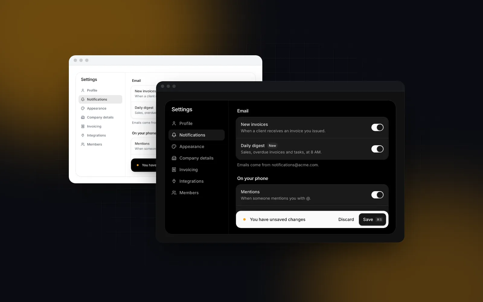
So the owner edits what others see right where others see it, in a sheet on top of the profile, and goes to /settings for the rest. Our Settings Page block covers that private side (profile, account, notifications, billing, security and a danger zone with a save bar), and the React settings page tutorial explains how it saves.
How do I install the profile page and wire it to Next.js?
A shadcn user profile page built from static markup leaves the follow state, the validation and the save flow to you. The block ships that behavior, so you install it instead of copying a react profile page template. The CLI adds the parts it builds on (avatar upload, swipeable tabs, sheet, timeline, the heatmap) and their npm packages:
ProfilePage is a client component that takes data as props and reports what the user did through callbacks. Fetch the profile in a server component, decide whether the viewer owns it there, and hand the data to a small client wrapper:
The wrapper connects the callbacks to your API. onFollow and onSave may both return a promise: Follow flips first and rolls back on a rejection, Save keeps its spinner while the promise runs and shows the rejection's message in the sheet.
The last two lines of onSave matter more than they look. The handle is part of the URL, so a renamed user would otherwise refresh into a 404 on the old address.
user needs id, name, handle, followers and following; everything else (avatar, cover, headline, bio, links, status, verified) is optional and simply hides when missing. Without any props the block renders a sample profile, Emma Carter from Brooklyn, which is handy while your API is not ready yet.
How should the Follow button and the counters behave?
Optimistically. The block flips Follow to Following the moment you press it, pops in a check, adds one to Followers, and announces "You follow Emma Carter" to screen readers. Then it awaits onFollow(true). If that rejects, the button flips back and screen readers hear "That did not work. Try again." A second press while a request is in flight is ignored, so a double tap never sends follow and unfollow in a race.
Two details keep the counter honest. If your data already says the viewer follows this person (user.isFollowing), the follower count you pass already includes them, so the block does not add one again. And if you own the follow state elsewhere (a store, a query cache), pass following and handle onFollow yourself; the block then only renders what you give it.
The Projects counter always opens the Projects tab. Followers and Following become buttons once you pass onStatClick, which receives "followers" or "following" so you can open a list in a sheet or route to /u/emma/followers.
How do the swipeable tabs and the heatmap work?
The tabs are Swipeable Tabs with the underline variant. On a desktop they follow the WAI-ARIA tabs pattern: arrow keys move between tabs, Home and End jump to the first and last (W3C APG tabs pattern (opens in a new tab)). Below 768px the tab pages also follow a horizontal swipe, the way a native profile screen does, while vertical scrolling still scrolls the page. If a tab holds a horizontal carousel or a map that would fight the gesture, put data-no-swipe on that element so horizontal drags that start on it stay with it, or pass swipeable={false} to turn the swipe off. We wrote more about the gesture in React swipeable tabs.
The Overview heatmap is GitHub Activity, which is free. It takes a year of days, each { date, count, level } with level from 0 to 4, starting on a Sunday. Compute the level on the server so the client only paints cells:
These are the same thresholds the sample data uses. If your users act far more often, raise them, or the whole year turns the darkest green. heatmapColor takes any CSS color (busier days are more opaque) and showHeatmap={false} or an empty array hides the grid. For the component on its own, with a GitHub username instead of your data, see the React GitHub contribution graph guide.
How does the edit profile sheet validate and save?
On the owner's page, Edit profile opens a Sheet from the right on desktop and a bottom sheet with a drag handle on phones. It holds the photo, name, username, a bio with a 160 character counter, location and website. The photo field is Avatar Upload, so the owner can crop, watch the upload progress or remove the picture. Pass onAvatarUpload to send the cropped blob to your storage and resolve the new URL; without it the photo stays a local preview until Save.
Open the sheet below and press Save with an empty name, then type a username with a space in it.
$ npx wingo-ui@latest add profile-pageSave checks three things before it calls onSave: the name is not empty, the username is 3 to 20 letters, numbers or underscores (a leading @ is stripped), and the website looks like an address. The first invalid field takes focus, and after that first attempt the messages update as you type. Valid values arrive trimmed, with https:// added to a bare example.com. While the promise runs, Save shows a spinner and the sheet refuses to close, so Escape cannot drop a half-saved draft. A rejection keeps the draft and shows the error's message in the sheet. A success updates the header at once and closes it.
Still validate on the server. The client check is there to save a round trip, and a username can be taken between the moment the sheet opened and the moment Save was pressed, so return a clear error message and the sheet shows it.
What happens on a phone?
The layout is mobile first. Below 640px the header stacks: the avatar overlaps the cover, the counters turn into three equal tiles, and Follow and Message move to the bottom of the header and share its full width. The tab pages swipe, and the edit sheet becomes a bottom sheet with full-width Cancel and Save buttons that keeps the keyboard down until you tap a field. To check a brand new account, pass projects={[]} with defaultTab="projects": the empty state says "No public projects yet" instead of leaving a blank grid.
What should I watch out for?
Four things go wrong in production more often than the layout does.
- Leaking private data. The
userobject reaches the browser. Map your database row toProfileUseron the server and leave out email, phone and internal flags. - Stale counters after a save. The header shows the saved values right away; when your parent passes a new
userobject later, that replaces them. Refresh or revalidate the route after a successful save (therouter.refresh()above) so both agree. - Hydration and time. Relative times like "Updated 5 hours ago" read the live clock only after hydration, so the server HTML leaves them out and nothing mismatches. Pass
nowwhen you need them in the server HTML, and in tests and screenshots so they never drift. - Translations. Every visible string lives in
labels, merged overDEFAULT_PROFILE_PAGE_LABELS, andlocaleformats the counters and dates (1,284 inen-US, 1.284 inde-DE).
Where to go next
If you are building the rest of the app around this screen, the Build it: screens and apps category collects our other page guides, and the SaaS website template guide covers the public pages that sit next to it. For a portfolio site rather than an in-app profile, the Next.js portfolio template is the better fit.
The Profile Page and Settings Page blocks are part of Wingo UI Pro (plans and prices). The heatmap, avatar, sheet and form fields are free: create a free account, run npx wingo-ui@latest add github-activity avatar sheet, and start from there.
FAQ
What should a user profile page include?
A cover or colored band, the avatar, the name with the handle, a short bio, location and links, the main actions (Follow and Message, or Edit profile on your own page), a few counters and the person's work in tabs. Keep anything only the owner should see, such as the email address, off the public page.
What is the difference between a profile page and a settings page?
The profile page shows a person to everyone and lets the owner edit the public fields in place. The settings page is private: email, password, two-factor, notifications, billing and account deletion. Linking Edit profile to a sheet and Settings to its own route keeps the two from blurring.
Should the Follow button wait for the server?
No. Flip it at once, add one to the follower count, then send the request, and flip it back with a message if the request fails. Waiting a few hundred milliseconds for every tap makes the button feel broken on a slow phone connection.
Is there a free shadcn profile page template?
The Wingo UI Profile Page block is part of Pro, and so are the Avatar Upload, Swipeable Tabs and Timeline parts it uses. The GitHub Activity heatmap, Avatar, Sheet, Button, Card, Badge, Input and Textarea are free with a free account, so you can assemble a simpler profile from those.
How do I show a contributions heatmap on a React profile?
Pass a year of days shaped as { date, count, level } with level from 0 to 4 to the heatmap, starting on a Sunday. Compute the level on the server from your own activity table, so the client only renders cells.
- Profile
- shadcn
- React
- Next.js
- Mobile UI