Shadcn Password Input: Show/Hide, Strength Meter, Caps Lock
You need a password field with an eye icon, maybe a strength meter for sign-up, and you search for a shadcn password input. The first surprise: shadcn/ui does not ship one. As of November 5, 2026 the shadcn/ui component list (opens in a new tab) has Input, Input Group and Field, but no password input, so what you find are community snippets built on Input. The eye icon is the easy part. The details that decide whether the field works for real people are where the caret goes when the type switches, whether a screen reader hears the state, what password managers are told, and what happens with Caps Lock on.
This guide walks through those details with the Password Input from Wingo UI, the library we build, so we are not neutral. Outside facts link to their sources.
What should a shadcn password input handle?
Our checklist for a login field, before anything about strength:
- A real reveal button. A
<button type="button">in the Tab order, anaria-labelthat says what it does ("Show password", "Hide password") andaria-pressedfor the current state. - The caret stays put. Switching
typefrompasswordtotextdrops the selection in some browsers, so the caret jumps to the end or the start. SaveselectionStart,selectionEndand the direction before the switch and restore them after. - Password managers get the right hint.
autocomplete="current-password"on login,"new-password"on sign-up and password change. - The browser leaves the text alone.
spellCheck={false},autoCapitalize="none"andautoCorrect="off", so revealed text is not underlined, capitalized or sent to a spellchecker. The GOV.UK password input (opens in a new tab) sets spellcheck and autocapitalize the same way (checked November 5, 2026). - Caps Lock is visible. A short warning under the box while Caps Lock is on and the field has focus.
- Phones work. A 16px font so iOS does not zoom, 44px hit areas for the icon buttons, and an
enterKeyHintthat matches the next step ("go" on login, "next" on sign-up).
The Wingo UI component sets every item on that list by default:
label, description and error come from the shared Field wrapper, so the label is linked with htmlFor, the hint with aria-describedby, and an error replaces the hint and sets aria-invalid. fieldProps.labelAction puts the "Forgot password?" link on the label row, where people look for it.
$ npx wingo-ui@latest add password-inputHow do I build a shadcn password input show/hide toggle that keeps the caret?
A typical shadcn password input show hide snippet is a useState boolean, an absolutely positioned button and type={visible ? "text" : "password"}. That works until someone edits the middle of a long password, reveals it to check, and keeps typing at the wrong spot. The fix is three steps:
- On click, read
selectionStart,selectionEndandselectionDirectionwhile the input still has focus. - Flip the state.
- In a layout effect on the visibility, call
setSelectionRangewith the saved values, then once more on the next animation frame, because Chrome resets the selection a second time after a real mouse click.
The button also calls preventDefault() on pointerdown and mousedown, so the click does not blur the input first; otherwise there is no focused selection left to save. The Wingo component does all of this internally; you control visibility only when you need to, for example one checkbox that reveals two fields:
Should the eye button be in the Tab order?
Yes. Some snippets add tabIndex={-1} to keep Tab moving from the password to the submit button. That removes the show password toggle for keyboard and switch users, the people who most need to check what they typed. Keep it focusable, give it an aria-label, and set aria-pressed, so a screen reader announces it as a toggle button with its label and pressed state. In the Wingo component the label follows the state ("Show password" while hidden, "Hide password" while shown), and the button carries aria-controls pointing at the input. Change the words with showLabel and hideLabel, and swap the Lucide Eye and EyeOff icons with showIcon and hideIcon.
Should the password hide again on submit?
GOV.UK switches the field back to type="password" when the form submits, so the browser does not remember the value as a previous entry and suggest it in ordinary text fields. The Wingo component does not do this by itself. Control visible and hide the password in your submit handler; flushSync makes sure the input is back to type="password" before the browser reads the form:
How does the Caps Lock warning work?
KeyboardEvent.getModifierState("CapsLock") returns the current state, and so does the same method on mouse events. Read it in keydown, keyup and mousedown while the field has focus, show a warning, and hide it on blur. The Wingo component keeps a role="status" region mounted under the box so the warning is announced when it appears, and adds it to aria-describedby while it shows. Phones do not report Caps Lock, so on a touch screen the warning simply never appears. Turn it off with capsLockWarning={false} or reword it with capsLockLabel.
How do I add a react password strength meter?
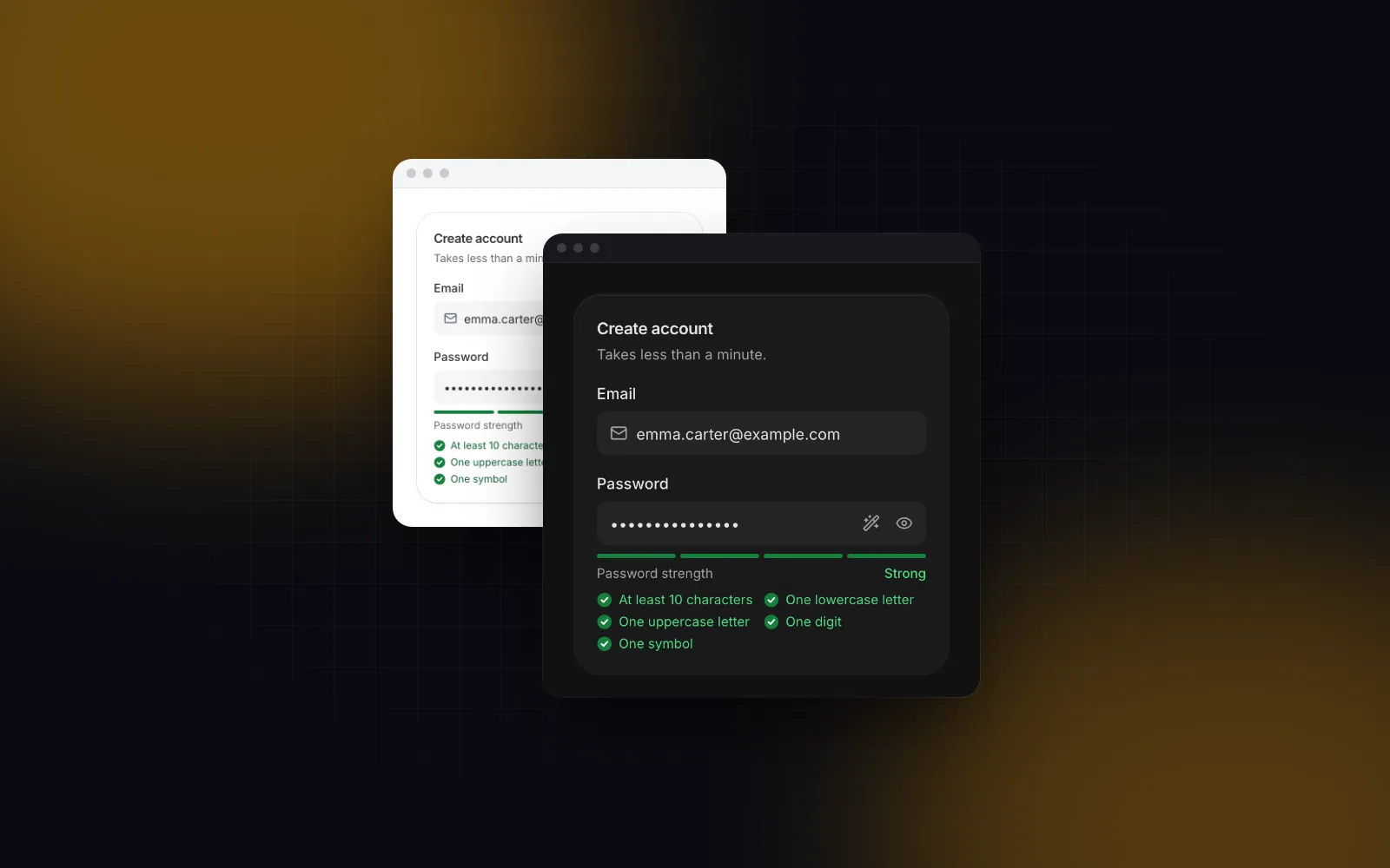
Pass strength and the field becomes a sign-up field: four bars that fill as you type, a verdict in words next to them, a rules checklist that opens on focus, and autocomplete="new-password". Add generate for a wand button that fills a random password.
$ npx wingo-ui@latest add password-inputA few choices in that code are deliberate:
- The verdict is text, not only color. Red, amber and green bars mean nothing to someone with color blindness. The label next to the bars says "Weak" or "Strong".
- The bars are hidden from screen readers and the verdict goes to a polite live region 500ms after typing stops, so a screen reader user hears "Password strength: Good" once instead of a new message on every key.
- Each rule announces its state. The checklist is linked to the input with
aria-describedbywhile it is open, and each row ends with a visually hidden "met" or "not met" (ruleMetLabel,ruleUnmetLabel). - The checklist does not collapse on blur while there is text. If it did, the submit button below it would jump up just as a thumb reaches for it.
- The generator uses
crypto.getRandomValueswith rejection sampling, skips look-alike characters (0, O, l, 1, I), guarantees one of each character class, and reveals the result until focus leaves the field.
Is the default password strength indicator good enough?
No, not on its own. It is a guide. The default scorePassword returns 0 for empty, short or common passwords, adds a point per met rule beyond length (up to 3), adds one for 12 or more characters, and takes one away for repeats like aaa or runs like 1234. That catches the obvious cases. It does not know that Summer2026! is a pattern attackers try early: it has all four character classes, so the default meter rates it Good.
When the score gates sign-up, swap in a real estimator through the score prop. With zxcvbn-ts (opens in a new tab) (setup checked November 5, 2026):
The dictionaries are large, so load this only on the sign-up route.
What do the current guidelines say about password rules?
They say length and a blocklist, not character mixes. The revision 4 text of NIST SP 800-63B (opens in a new tab) (section 3.1.1, checked November 5, 2026) says verifiers shall not impose composition rules, should permit at least 64 characters, should offer an option to display the password, shall allow password managers and autofill, and should permit paste. It requires at least 15 characters when the password is the only factor and 8 when it is part of multi-factor sign-in, and it requires comparing new passwords against a blocklist of common, expected and compromised values. In practice:
- Keep a length rule and drop the uppercase, digit and symbol rules:
rules={passwordRules({ minLength: 15 }).filter((r) => r.id === "length")}. Use a real estimator for the meter too: the default score adds a point per class rule in the list, so with only the length rule it never climbs past 1. - Never block paste, and never set
maxLengthbelow 64. - Run the blocklist check on the server. The client meter is advice; the server decides.
What else trips people up?
Four smaller things: a confirm field, password manager icons, autofill and login error copy.
- A confirm password field. GOV.UK says a second field is not necessary, because the show toggle lets people check what they typed. If you keep one, compare on blur, not on every keystroke, and give each toggle its own label.
- Password manager icons over your eye. Some password manager extensions draw their own icon at the right edge of the input element. In the Wingo component the eye and wand buttons sit outside the native input, so that icon lands before the toggle instead of on top of it.
- The meter flashing on autofill. A manager can fill the field before the person touches it. The component keeps scoring the starting value until the field gets focus, so an autofilled password does not make the bars jump on page load.
- Validation copy. For login, keep one generic error for a wrong email or password. Our shadcn login page guide covers the reasons and the full flow.
Where does the password input fit in a whole sign-up form?
It is one field in a block that already handles the rest. A password field is one step of a form that also needs an email, a submit state and errors from the server. The Register Page block wires the Password Input to react-hook-form and zod: the same rules feed the checklist and the schema, so the checklist and the validation never disagree, and a minimum score (2 by default, set with passwordMinScore) blocks weak passwords before submit. The Login Page block uses the login variant with the "Forgot password?" action. For the rest of the form, the Input and Field components share the same box, sizes and error anatomy, and our React form components guide covers labels, zod and mobile keyboards across all of them. More component guides live in the components category.
Next step
Field and Input are free. The Password Input and the Register Page block are part of Wingo UI Pro (pricing). Open the Password Input docs, try the six examples there (sign-up rules, Caps Lock, generator, confirm, controlled visibility, sizes), and install it with npx wingo-ui@latest add password-input when it fits your form.
FAQ
Does shadcn/ui have a password input component?
No. As of November 5, 2026 the shadcn/ui component list has Input, Input Group and Field but no password input, so every shadcn password input you find is a community snippet or a library component built on top of Input.
Should the show password button have tabIndex -1?
No. Keyboard and screen reader users need to reach it, so keep it a real button in the Tab order with an aria-label and aria-pressed that reflect the current state. The GOV.UK password input uses a native button element for its show toggle, which is focusable by default.
How do I build a React password strength meter?
Score the password from 0 to 4, fill one bar per point, and print the verdict in words next to the bars so color is not the only signal. Announce the verdict through a polite live region after typing stops, and use a real estimator such as zxcvbn-ts when the score gates sign-up.
How do I detect Caps Lock in a password field?
Call event.getModifierState("CapsLock") in keydown, keyup and mousedown handlers while the field has focus, and hide the warning on blur. Phones do not report the Caps Lock state, so the warning only appears with a hardware keyboard.
Should a sign-up form force uppercase, numbers and symbols?
No. NIST SP 800-63B revision 4 says verifiers shall not impose composition rules and shall compare new passwords against a blocklist of common and compromised values. A length rule, a server-side blocklist check and a real strength estimate follow that guidance better than a five-rule checklist.
- Password
- Forms
- Authentication
- Accessibility
- shadcn/ui