Onboarding Checklist UI: The Get Started Card in React
The onboarding checklist UI is the Get started card a new customer sees on the dashboard after sign up: four or five tasks, a progress bar, a button next to each task. Plenty of onboarding checklist React examples stop at a list with checkboxes. A real one has to answer harder questions: which tasks go on it, where the progress is saved, what happens when someone hides it, how it fits on a phone, and how it hands off to a product tour without nagging. This guide answers each one with the Wingo UI Setup Checklist and plain Next.js code you can copy.
What tasks belong on a SaaS onboarding checklist?
The tasks that get a new account to its first real result. For an invoicing app that is connecting payments and sending a first invoice, not filling in a bio. A useful SaaS onboarding checklist follows four rules:
- Three to five counted tasks. Each one should move the account closer to doing the job it signed up for.
- Every task has an action. "Connect Stripe" opens the Stripe flow. A task people can only read about is a to-do note, not onboarding.
- Optional steps stay out of the count. "Get the mobile app" is nice to have. Tag it optional so the bar can reach 100% without it.
- Real head starts only. If sign up already created the workspace, show that task as done. In their endowed progress study (opens in a new tab) (Journal of Consumer Research, 2006), Nunes and Drèze gave car wash customers loyalty cards with two of ten stamps already filled in, and those customers were more likely to finish the card than people with a blank card of eight. On a checklist, credit only steps the person really did, so the head start stays honest. A bar that says 20% for opening the app reads as a trick.
How do I build the Get started card in React?
A get started checklist is one component with a list of items. Install it with npx wingo-ui@latest add setup-checklist. The CLI copies setup-checklist.tsx into components/ui along with the Progress bar, Button and Popover it uses, and installs motion and lucide-react. Then pass it the tasks:
Zero props beyond the items already gives you a finished card: the title "Get started", an "x of y done" count with a bar, the first open task expanded, one task open at a time. Wiring onCompletedChange turns each round check into a checkbox people can toggle. Without it the checks only show state, which is what you want when the server decides what is done. An item with its own done stays read-only either way. When the last counted task is checked, a "You're all set" panel replaces the list and the card folds up after doneDelay (4000 ms by default; 0 keeps it open).
$ npx wingo-ui@latest add setup-checklisttone defaults to neutral, and we keep it there on dashboards because a brand-orange card competes with the page's main action. size="sm" with variant="inline" fits the card into a sidebar.
Where should onboarding checklist progress live?
On the server. Progress in React state or local storage resets on a new laptop and goes stale when someone connects Stripe from the settings page instead of the card. Split the tasks in two kinds:
- Tasks your data already knows. Logo uploaded, Stripe connected, first invoice sent. Compute them on the server and pass
doneon the item. An item'sdonewins overcompleted, so the check cannot drift from reality. - Tasks only the person can confirm. "Watched the tour", "Skipped the mobile app". Keep those ids in a small record on the user and save it with a server action.
Data-backed tasks flip to done on the next render, wherever they were finished. If your action really finishes the task in place (a Connect button that runs the whole OAuth flow in a popup), markOnAction checks the item off when its main action is clicked.
How should dismiss and reopen work?
Dismiss hides the card for this person until they ask for it again. The x in the header (and the Dismiss button in the done state) hides the component and calls onDismiss. Save that, or the card comes back on the next page load and people learn to ignore it.
Reopening is your part. Put a "Setup guide" item in the Help or account menu that calls a server action to clear dismissedAt and revalidatePath("/dashboard"). The dashboard renders again with dismissed false, the checklist mounts fresh and shows today's progress with every data-backed task up to date. Two details matter:
- Keep skipping one task and dismissing the whole list as separate actions. Give the Invite your team task a
secondaryActionsuch as "Skip for now" whoseonClickadds that id tocompletedand saves it, so the rest of the list stays. - Retire the card when the account is clearly active. Someone who has sent ten invoices without a logo does not need it; set the same
dismissedAtflag on the server.
When should the checklist become a floating launcher?
When the page has no room for a card, or when the checklist should follow people around the app. variant="floating" renders a pill in the bottom corner with the title and the count. It opens the list in a popover on desktop and a bottom sheet below 768px, and it sits clear of the iPhone home indicator through safe-area insets. The demo below starts in the floating variant: tap the pill.
$ npx wingo-ui@latest add setup-checklistA pattern that works well: the card on the dashboard home, the launcher on other pages until the account finishes or dismisses it, both reading the same server record. The floating panel always starts closed, so it never covers the page on load.
How does the checklist hand off to a product tour without nagging?
Make the tour a task instead of a pop-up. A tour that auto-starts over a checklist that also wants attention is the worst first visit. Put "Take the 1 minute tour" on the list as an optional task, start the Tour from its action, and check the task off when the tour ends either way:
No autoStart here on purpose. The person chooses when to see the tour, persistKey remembers in local storage that it was finished or skipped, and start() still replays it from the Help menu later. Local storage is per browser, so in production finish should also save the tour id with the other manual ids, as in the server example above; that record is the one that follows people to a new device. With the floating variant, control its open prop and close the panel before calling start(), so the spotlight is not hidden behind the list. For the full tour setup, including the docked phone card, read our guide to the React product tour.
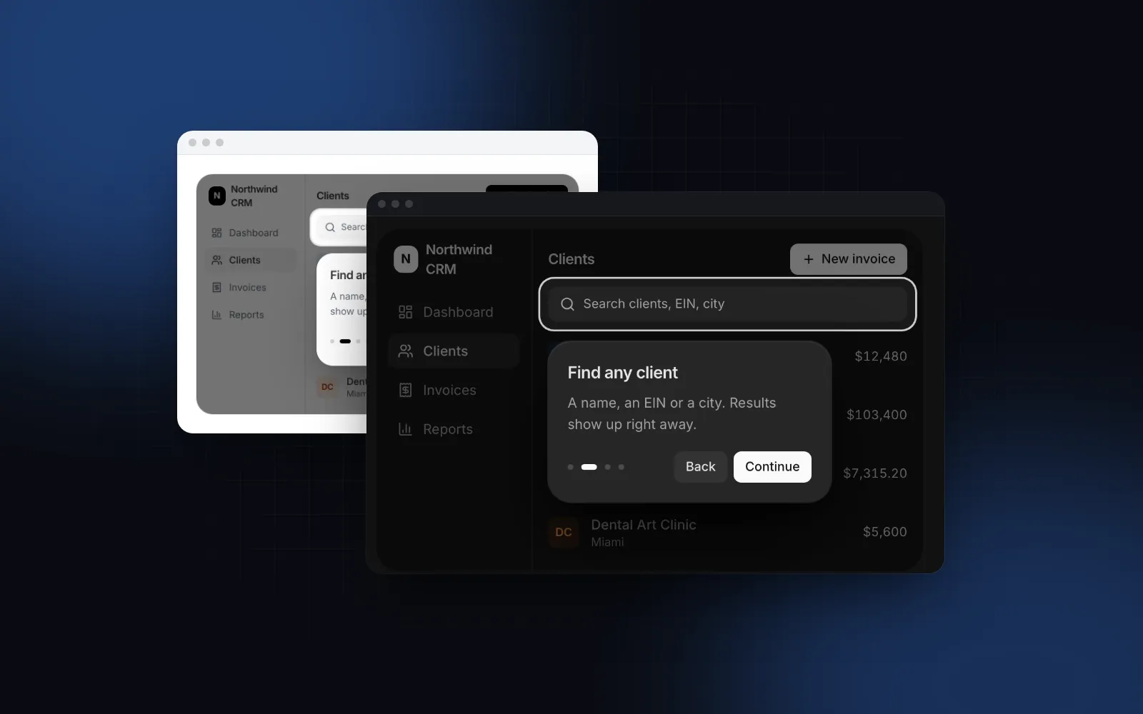
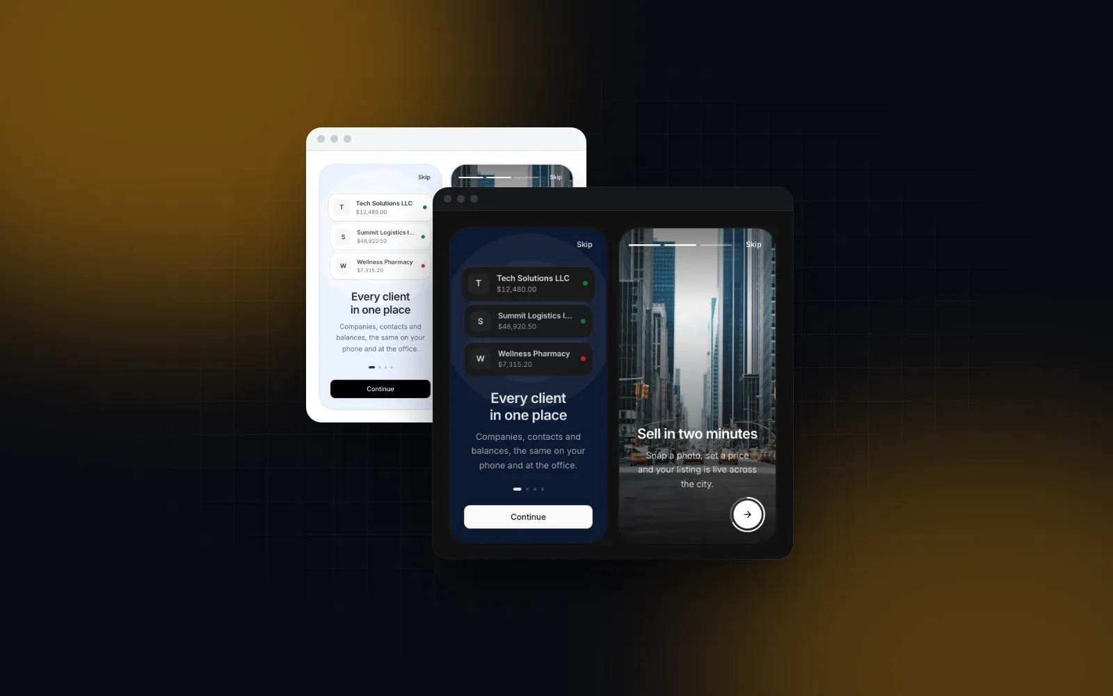
The checklist comes after the first-run flow, not inside it. Welcome slides, permission asks and the profile step belong to the Onboarding Flow, which ends on the dashboard where the checklist picks up (see our React onboarding flow tutorial).
Does it work on phones and with a keyboard?
Yes. Each task header is a real button with aria-expanded, and the check is a role="checkbox" with aria-checked once you wire onCompletedChange. Tab reaches each task, ArrowUp, ArrowDown, Home and End move between them, Enter or Space expands one, and Space toggles a focused check. The progress bar gets its name from the count text, so a screen reader hears "2 of 4 done". On touch screens the rows grow to 44px, and below 640px the action buttons go full width, so a thumb lands on the task it meant.
How does it compare to shadcn onboarding checklist blocks?
shadcn/ui has no checklist component of its own, so a shadcn onboarding checklist comes from a third-party registry. What the public pages say, as of November 6, 2026:
A community block is fine for a prototype. For production, check saved progress, the phone layout and keyboard support before you pick one.
How do I add it to my app?
Run npx wingo-ui@latest add setup-checklist, map your setup tasks to items with done from your own data, and save the manual ids and the dismissal on the user. The Setup Checklist and the Tour are part of Wingo UI Pro ($8 a month, $80 a year or $150 once); the Progress bar is free if you would rather build a simpler card yourself. If you need the dashboard around it too, the Pro admin dashboard page block gives you the shell and a home screen to put the card on. More complete screens are in the Build it: screens and apps category, starting with the Next.js admin dashboard tutorial.
FAQ
How many tasks should an onboarding checklist have?
Three to five tasks that each lead to a real result, such as connecting payments or sending a first invoice. Mark nice-to-have steps as optional so they stay out of the count, and move advanced settings to the places where people need them.
Should an onboarding checklist start partly complete?
Only with steps people really did, such as creating the workspace during sign up. A head start based on finished work helps people see they are already on the way; a bar that credits nothing feels like a trick.
Where should I store onboarding checklist progress?
On the server, next to the user or workspace. Derive tasks like Connect Stripe from your own data and save the manual ones and the dismissal in one small record, so progress follows people to a new phone or browser.
Can people hide the onboarding checklist and get it back?
They should be able to. Hide it on dismiss, save the dismissal, and add a Setup guide item to the Help or account menu that clears the flag and shows the card again.
Is there a shadcn onboarding checklist component?
shadcn/ui itself has no checklist component as of November 2026. Third-party registries such as shadcn.io and 21st.dev list onboarding checklist blocks, and the Wingo UI Setup Checklist installs the same way with npx wingo-ui@latest add setup-checklist.
Is the Wingo UI Setup Checklist free?
No. The Setup Checklist, the Tour and the Onboarding Flow are Pro. The Progress component, which you can use to build a simpler card yourself, is free.
- Onboarding
- SaaS
- Dashboard
- React
- Mobile UI