Claude Code Landing Page That Does Not Look AI-Made
You asked Claude Code for a landing page and got the one everybody gets: a gradient headline, three cards with icons, "Trusted by 10,000+ teams" for a product with no users yet, and a testimonial from a person who does not exist. A Claude Code landing page looks AI-made when the agent has to invent everything. Give it real sections, your tokens and a rules file, and the same agent produces a page that looks like your product.
This tutorial builds the home page of a small invoicing app in Next.js with that setup. The sections come from Wingo UI (Hero Section, Pricing Section, FAQ Section and CTA Section), but the order of work applies to any library with an MCP server. More on agents and UI is in Building UI with AI agents.
Why does a Claude Code landing page look AI-made?
Every decision the prompt leaves open gets the most common answer. A centered hero over a purple glow is common. So are three feature cards, a logo strip, a customer count and three quotes. None of these is wrong on its own. Together, with nothing from your product in them, they are the look people now recognize.
Two published approaches make the same trade. The landing-page skill in jezweb/claude-skills (opens in a new tab) (last updated August 21, 2026) writes one HTML file with Tailwind loaded from a CDN, and the GemPages tutorial (opens in a new tab) (updated June 8, 2026) asks for "clean semantic HTML with embedded CSS". That is a fine way to get a one-off page. It is not how you want the home page of a Next.js app built, where the page should share components, tokens and dark mode with everything else.
The worst tell is invented proof. A model asked for social proof writes social proof, with numbers. That is a design problem and a trust problem, and the fix belongs in the rules file, which every session reads, instead of in one prompt.
What do you set up before the first prompt?
Four things, each of which removes a group of decisions from the model:
Step 1: How do you connect Claude Code to real sections?
Run these in the project root. login stores a key for the CLI (a free account works for free items), and agents install claude writes the MCP entry to .mcp.json, a block in CLAUDE.md and a wingo-ui skill in .claude/skills/, which tell Claude Code to search the library before it writes UI. Without WINGO_UI_API_KEY in your environment, the MCP entry runs through a local stdio proxy that uses the key from login:
If you prefer to add the server by hand, the MCP docs list the command:
Restart Claude Code and check /mcp. The tools that matter for a landing page are search_components (find sections by keywords), get_component and get_block (props with their defaults, the parts and the install command), get_design_rules and get_theme_tokens. With those, Claude reads layout?: "centered" | "split" | "stacked" | ... from the source of truth instead of guessing a prop name.
Then install the sections. Doing it yourself keeps the first agent session about copy and composition. The hero and pricing sections are Pro items, so this line needs a Pro key; the other four install with a free one:
Step 2: How do you set tokens so Claude stops picking colors?
Leave the components alone and change the tokens. The sections read semantic variables, so one block in app/globals.css turns the brand color from our orange into yours in both themes. The theme generator exports the same block if you want to pick it visually:
Then put the page-wide choices into provider defaults, so the shortest JSX Claude writes is already on brand. Every section reads its defaults by its slug, and explicit props still win:
socialProof: false matters most here. The hero and CTA sections ship with sample proof ("Loved by 12,000 teams", avatars, a rating) so their demos look finished. That copy belongs to the fictional Acme, not to you. Turning it off by default means Claude has to add proof deliberately, with real data.
Step 3: What goes in a Claude Code landing page skill?
A rules file with the facts and the bans, and a small skill that loads it whenever the task is the landing page. Keep the facts in the file, because the model cannot invent what it can read:
The skill's description is what Claude Code sees at the start of a session, so it names the files that trigger it. Our post on AGENTS.md vs CLAUDE.md covers where the always-on rules go, and the Claude Code design system tutorial adds a hook that greps every edited file for hex colors.
Step 4: Which Claude Code landing page prompts work?
Short ones that cover one section and name the component, the copy, what to leave out and the check. A Claude Code landing page prompt for the whole page at once gives the model too many open choices again. Here is the sequence for our page.
Prompt 1: plan, install nothing
Read docs/LANDING.md. For each section, tell me which Wingo UI component you will use, which props you will set, and which copy you still need from me. Write no code yet.
This surfaces gaps while they are cheap. If the plan lists a testimonials section, the rules file failed and you fix it there.
Prompt 2: the hero
Build the hero in app/page.tsx with HeroSection, layout split. Title and description from docs/LANDING.md. Primary action "Start free" to /signup, secondary "See pricing" to #pricing. Replace the default mockup with public/shots/invoice-editor.png inside BrowserFrame. No announcement pill.
Naming the screenshot matters. The default media is a drawn workspace for the sample product, and a drawing of someone else's app is another tell.
$ npx wingo-ui@latest add hero-sectionPrompt 3: pricing from real data
Add PricingSection with id "pricing" and the plans from lib/plans.ts. Featured plan: pro, with the pill labeled "Recommended". Hide the compare link, we have no compare page. Set the footnote to "Prices in USD. Cancel any time." Read get_component first and do not invent prop names.
The footnote and pill lines are there because the defaults say "Paid plans start with a 14-day free trial" and "Most popular". If your product has no trial and no customers yet, both are false on your page.
$ npx wingo-ui@latest add pricing-sectionPrompt 4: FAQ and closing CTA
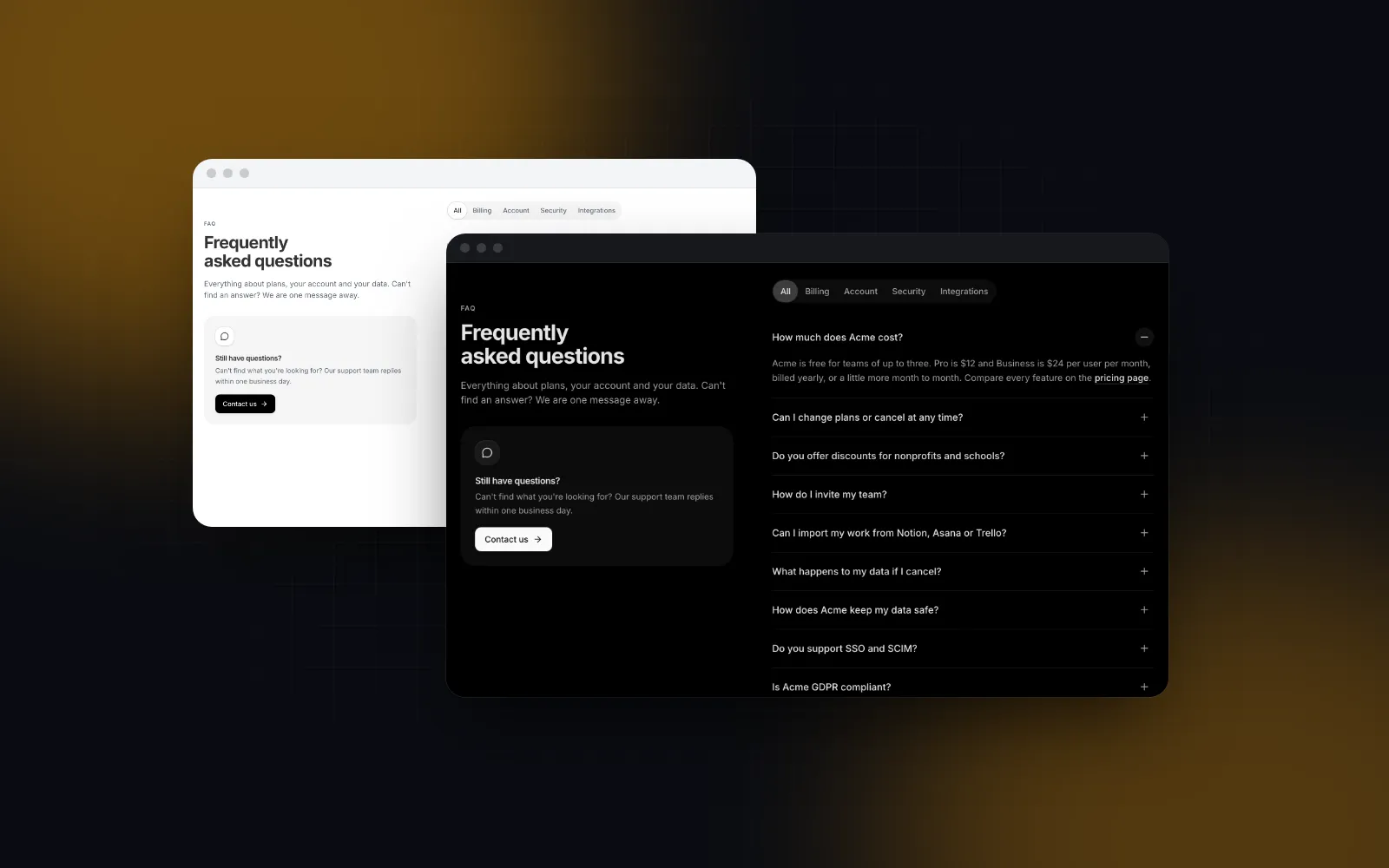
Add FaqSection with the questions in docs/support-questions.md, layout centered, jsonLd on, no categories, no contact card. Then a CtaSection: title "Send your next invoice with Northwind Invoices", primary "Start free" to /signup, secondary "Read the docs" to /docs.
Prompt 5: the check
Run the checks at the end of docs/LANDING.md. List every number on the page with its source, and every place where a component still shows its default copy. Then screenshot / at 390px and 1440px in light and dark and tell me what overlaps or wraps badly.
Keep this step even when the page looks right. An agent that reviews its own output against a written list has something concrete to find, like sample copy it forgot; asked "does it look good?", it has nothing to check against.
What does the finished page look like in code?
The page stays a Server Component, so metadata lives next to it, and every section is a client component imported directly. Props that the provider already sets are left out:
Two defaults are replaced here that are easy to miss: the featured plan's "Most popular" pill (a claim a new product cannot make) and the FAQ's contact card, which promises a reply within one business day. Wrap {children} in app/layout.tsx with the Providers from step 2, and put the header and footer there too if other marketing pages share them. Give the header your own items and the footer your own columns, legalLinks and socials, since their defaults are Acme's sample navigation.
$ npx wingo-ui@latest add cta-sectionHow do you check the page before it ships?
Look at it yourself, after the agent's check. Go through four things:
- Numbers. Search the rendered page for digits. Each one needs a source you could show a customer.
- Default copy. Search for the sample product name. In Wingo UI sections it is "Acme".
- Phone width. At 390px the split hero stacks, the actions go full width and the pricing cards become a rail. Read the headline at that width; long words in a big font are where wrapping goes wrong.
- Both themes. Your brand color has a light and a dark value for a reason. Check that the primary button and the soft tints read well in dark mode.
Our Next.js SaaS landing page guide goes through what each section has to prove and what to cut when you have no proof yet.
Should you start from the full template instead?
If your page follows the usual SaaS order, yes. The Landing Page template composes the hero, logos, bento features, a product tour, numbers, quotes, a pricing teaser, the FAQ and the CTA, with a design prop (classic, bold, editorial, minimal) that picks every section's look at once, and show* props to drop sections you cannot fill honestly. For a Claude Code home page that is the shortest path: one prompt to swap the content, one to turn off sections, one for the check.
Separate sections are the better choice when you need a different order, a section the template does not have, or only three of them, as in this tutorial. The Landing Page template, Hero Section and Pricing Section are part of Wingo UI Pro; the FAQ Section, CTA Section, Marketing Header and Marketing Footer are free.
For the agent side in more depth, the component library MCP guide covers what the server returns and how a full session runs, and the shadcn MCP setup for Claude Code shows how to run two registries side by side.
What is the next step?
Start with the free parts. A free account (email only, no card) gives the CLI and the MCP server a key for every free item. Run npx wingo-ui@latest login and npx wingo-ui@latest agents install claude, then install the closing band and the FAQ:
Then write your docs/LANDING.md before the first prompt. Good Claude Code landing page design starts with the rules file: it is the part that keeps the page yours.
FAQ
Can Claude Code build a landing page?
Yes. Claude Code writes the files into your project, installs packages and can run your dev server, so it can build a complete landing page in Next.js or plain HTML. The result depends on what it starts from: with no components, tokens or rules it falls back to the most common patterns it has seen.
Is there a Claude Code landing page skill?
Community skills exist, such as the landing-page skill in jezweb/claude-skills, which generates one self-contained HTML file with Tailwind from a CDN (as of November 2026). For a page inside an existing Next.js app, a short project skill of your own that points at your rules file and components fits better.
What is a good Claude Code landing page prompt?
One that covers a single section and names four things: the component to use, the real copy or where it comes from, what to leave out, and how to check the result. "Build a landing page for my app" leaves every one of those to the model.
Why does my AI-generated landing page look generic?
Because every choice you did not make is filled with the most common answer: a centered gradient hero, three icon cards, a made-up customer count and invented testimonials. Fix the choices before the first prompt with tokens, a section list and a rules file.
Should the landing page use a template or separate sections?
Use a full template when your page follows the usual SaaS order and you want a finished look fast. Use separate sections when you need a different order or only a few of them, since each one is configured through its own props.
- Claude Code
- Landing pages
- MCP
- Prompts
- Next.js